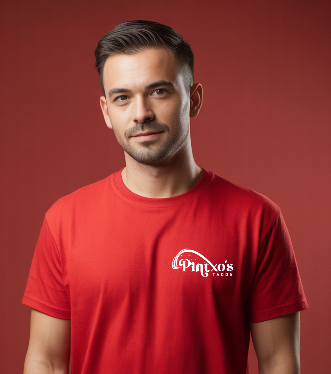
Pintxo’s Tacos

In-depth information about the project development and implementation

Client:

  • Pintxo’s Tacos

Industry:

  • Fast Growing Restaurant

Service Provided:

  • Logo Concept & Design
  • Visual Identity Development
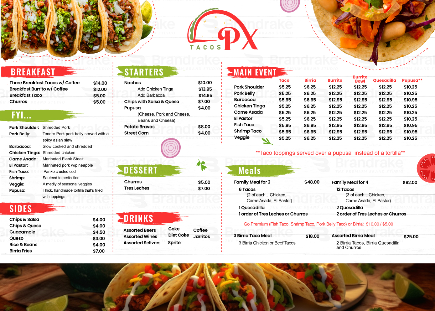
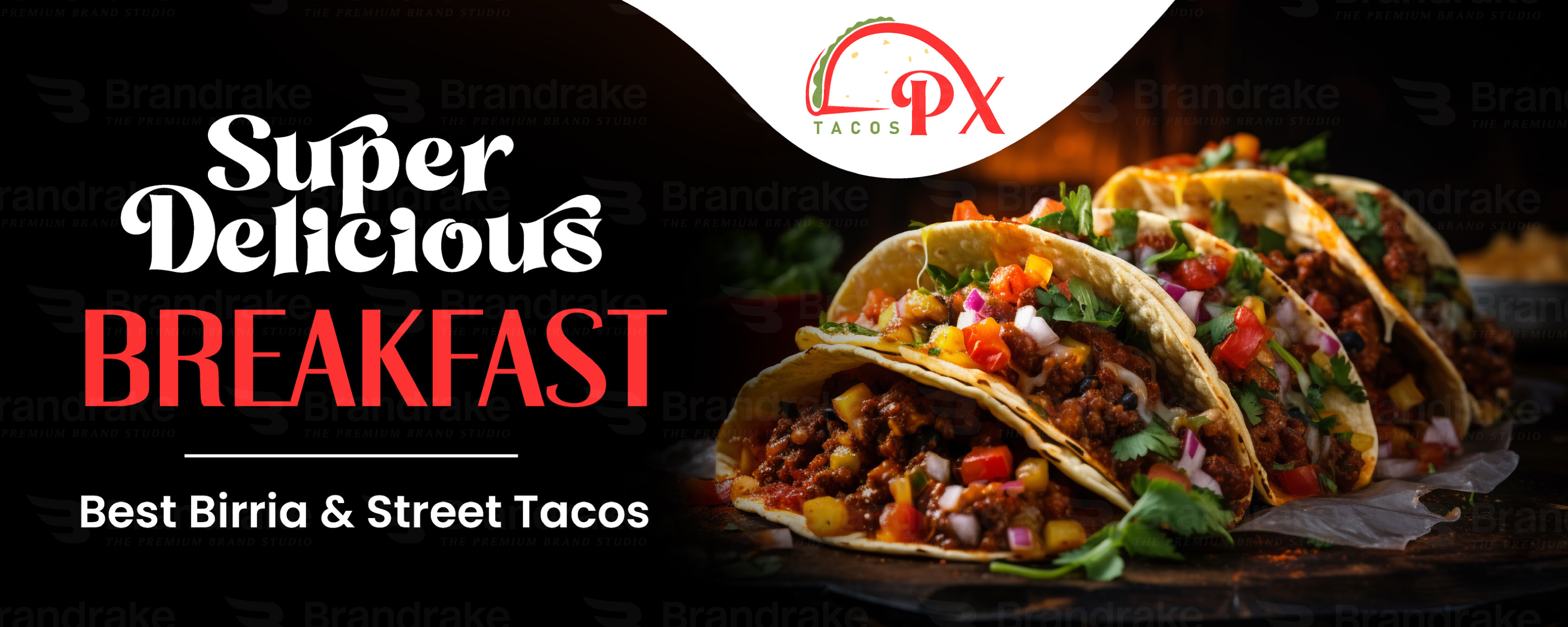
  • Label, Packaging, Menu Card, Banners, Flyer and etc
  • Mockup Applications

Deliverable:

  • Primary Logo Mark
  • Scalable Vector Files
  • Brand Color Palette
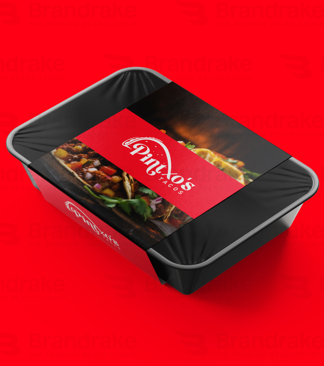
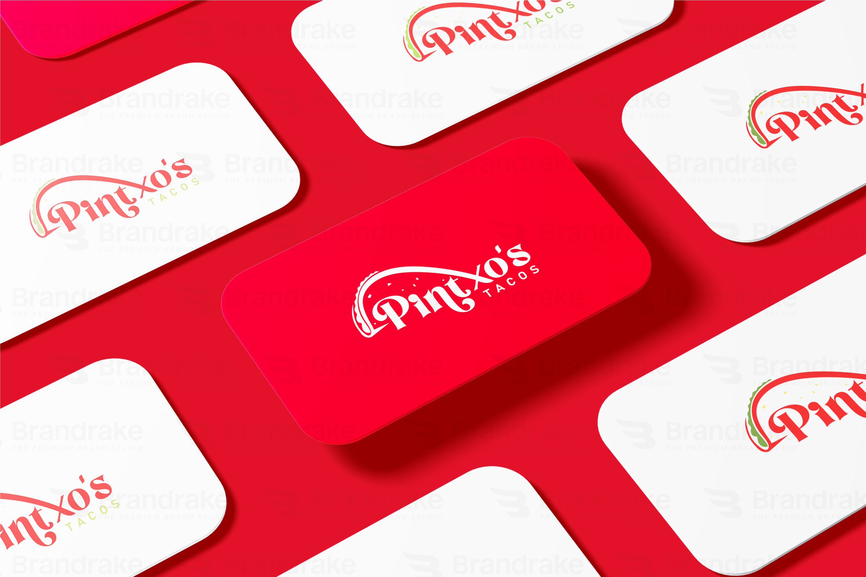
  • Mockups for real-world use: Business and Menu Cards and other


Project Overview 

Pintxo’s Tacos is a fast-growing restaurant known for its authentic taco meals, refreshing smoothies, and a wide range of fast food favorites. Located in a bustling food hub, the client wanted a brand identity that was flavorful, energetic, and instantly recognizable.

To craft a vibrant and memorable wordmark logo along with a compact brandmark that:

  • Reflects the fun and lively nature of the food.
  • Instantly connects with the idea of tacos and street food.
  • Is adaptable across digital platforms, packaging, and signage.


Creative Directions: 

The client specifically requested:

  • A typographic logo that feels expressive and flavorful.
  • A mini version (monogram) of the logo for use on small-scale branding like stickers, social media icons, and packaging seals.
  • Visual cues that subtly incorporate tacos or ingredients without being too literal.


Design Solution:

We created:

  • A wordmark logo where the curve of the “P” leads into a taco shell graphic, blending seamlessly into the name for a natural flow.
  • Fresh color palette: Tomato red, lettuce green, and tortilla gold flakes to represent the core ingredients.
  • A clean and scalable brand short version (PX) with the taco arc, ensuring recognizability even at small sizes.

Result

  • The branding helped Pintxo’s Tacos stand out in a saturated fast food market.
  • Customers immediately associate the taco arc element with the brand.

The short version logo performs excellently on delivery bags, app icons, and social content.