Delight Roots

In-depth information about the project development and implementation

Client:

  • Delight Roots 

Industry:

  • Organic Fruit Brand 

Service Provided:

  • Logo Concept & Design
  • Visual Identity Development
  • Brand Guidelines
  • Mockup Applications

Deliverable:

  • Primary Logo Mark
  • Scalable Vector Files
  • Brand Color Palette
  • Mockups for real-world use: Business card, Digital Media, Marketing Collateral


Project Overview 

The client envisioned a brand identity that would:

  • Highlight the organic and natural essence of their fruit offerings
  • Feature an orange as a symbolic and recognizable fruit
  • Optionally include a ‘DR’ lettermark, subtly integrated
  • Maintain a minimal, clean, and modern aesthetic
  • Establish brand recall and visual uniqueness in the organic market

Design Strategy

Visual Identity Analysis

The final logo successfully combines symbolism and simplicity:

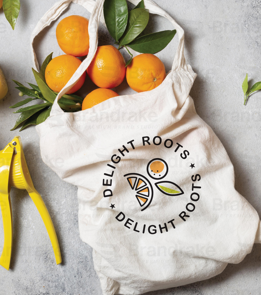
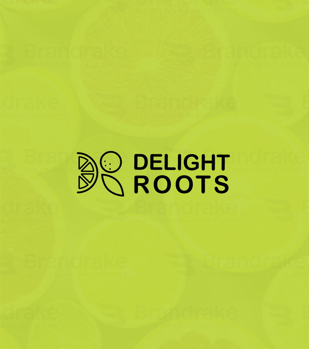
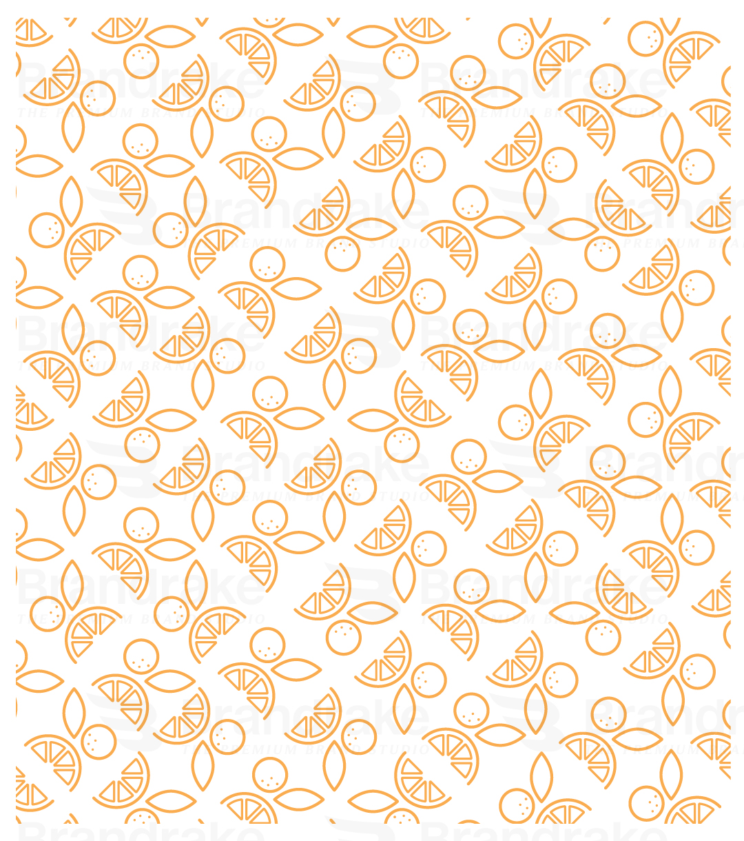
  • The 'D' is creatively formed using stylized orange slices, immediately conveying freshness and taste.
  • The 'R' takes shape through an abstract combination of a full orange (with juice droplets) and a leaf, cleverly building the second half of the letterform.
  • Together, these two abstracted shapes subtly and effectively form the "DR" monogram, fulfilling the client's request in a minimal yet memorable way.


Brand Development

We expanded the brand identity through:

  • Color Consistency: A balance between energetic and earthy tones for packaging and online visuals
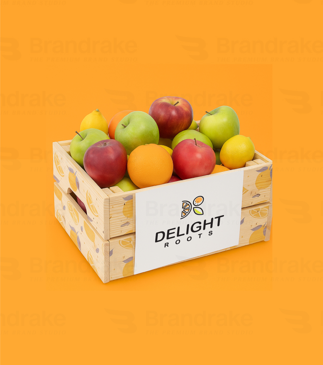
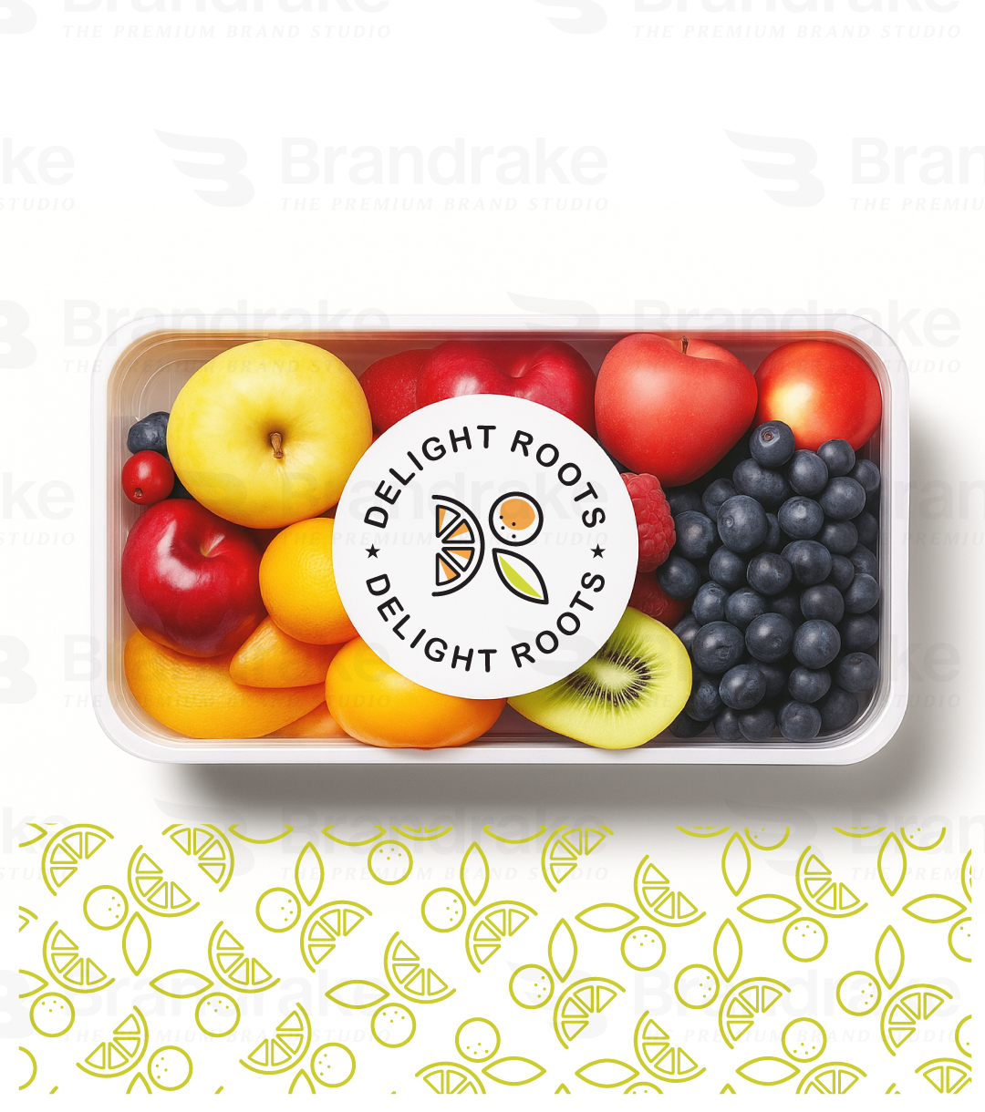
  • Packaging Concepts: Simple labels using the logo mark with space for clean ingredient or fruit details
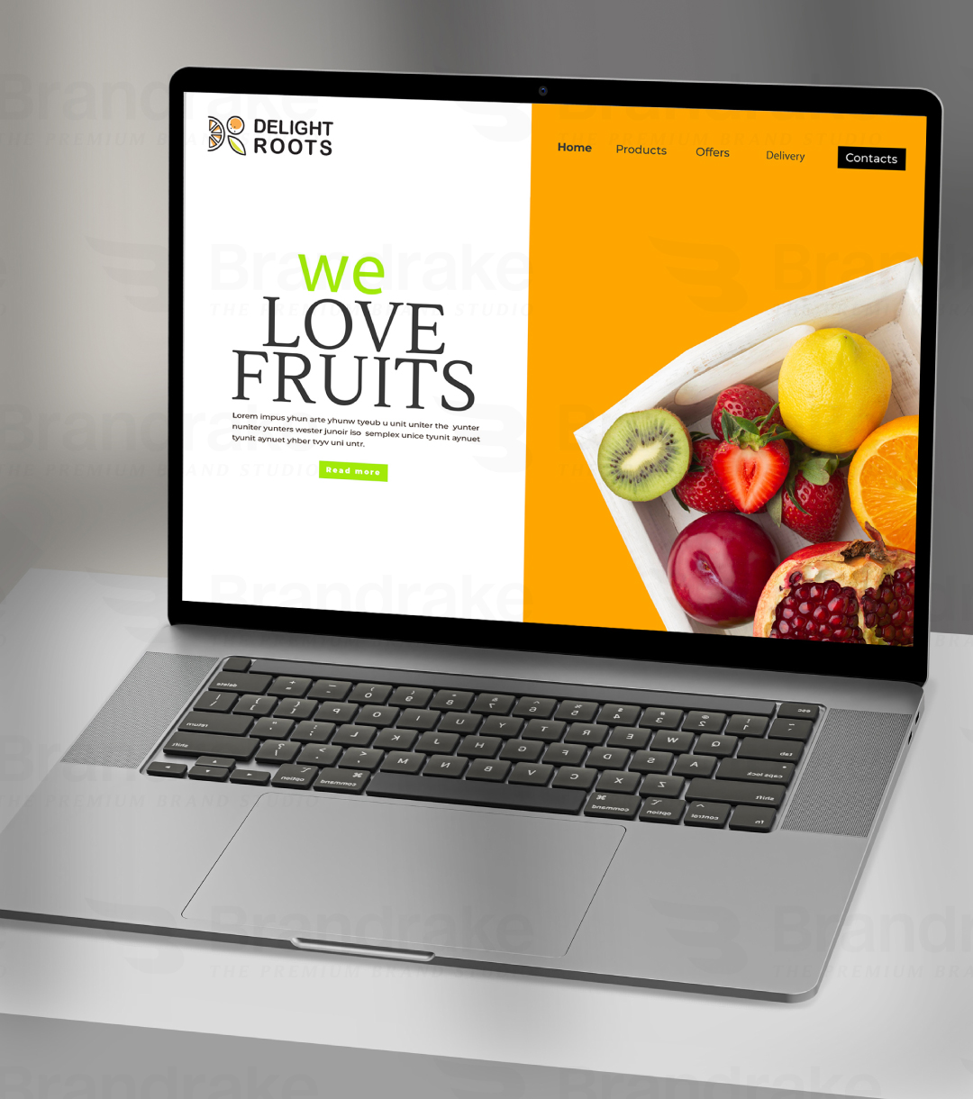
  • Digital Presence: Visual templates for Instagram and web that echo the playful but pure nature of the logo
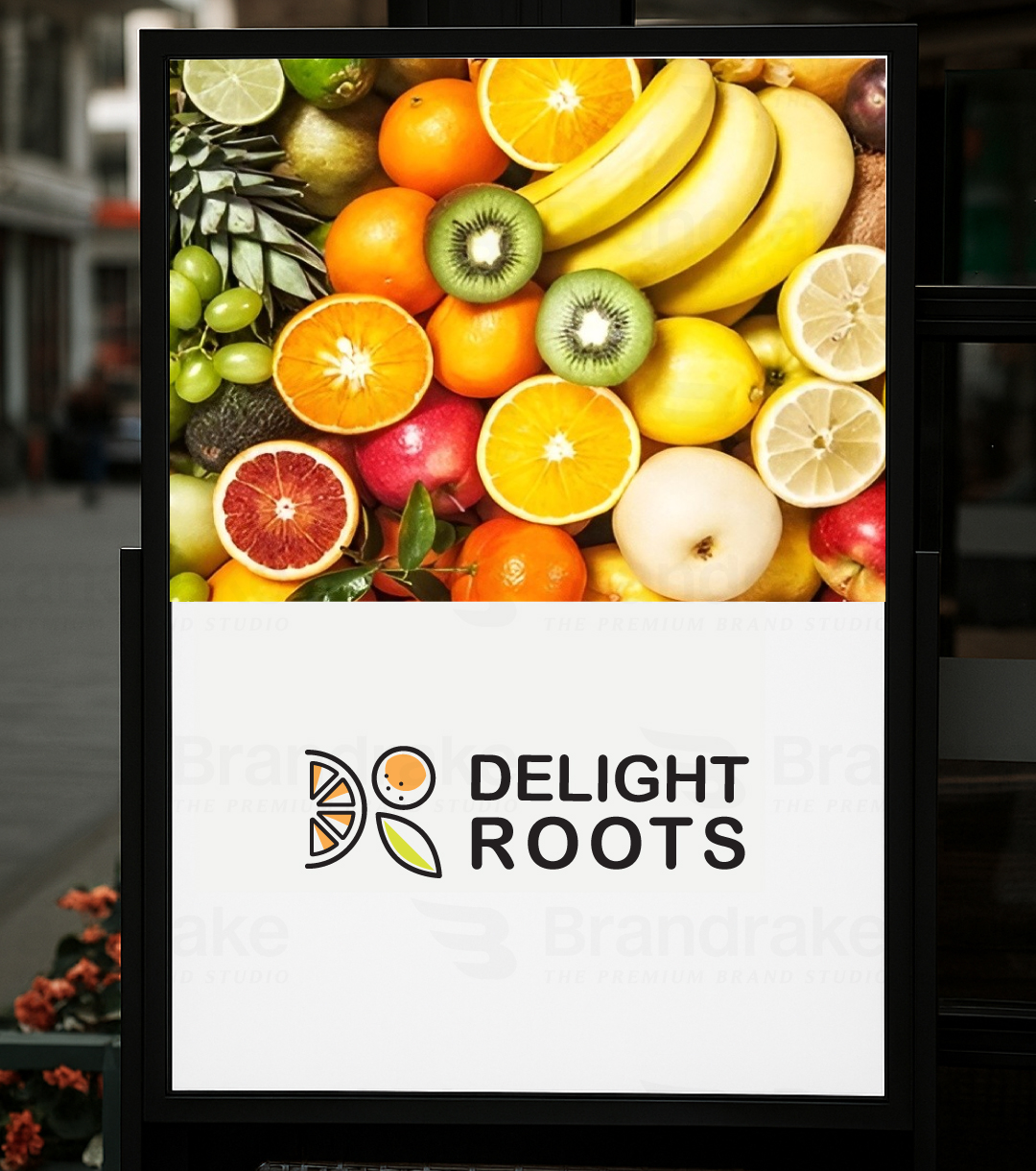
  • Merchandise & Labels: Minimalistic use of the icon for scalable branding—from crate labels to business cards

Conclusion

This project represents Brandrake’s commitment to building brands that don’t just look good—but feel aligned, thoughtful, and authentic to the audience and mission.